
Using Math Functions in CSS
Using Math Functions in CSS
🎬S3:E02 When CSS met high school math

Hey, TechFlixers!
They say math is the language of the universe. Turns out, math can be the language of CSS too.
If you have ever wondered what the use of all the random high school math and geometry you studied in web development, let me show you.
🔦 Spotlight
📢 How to use Math in CSS?
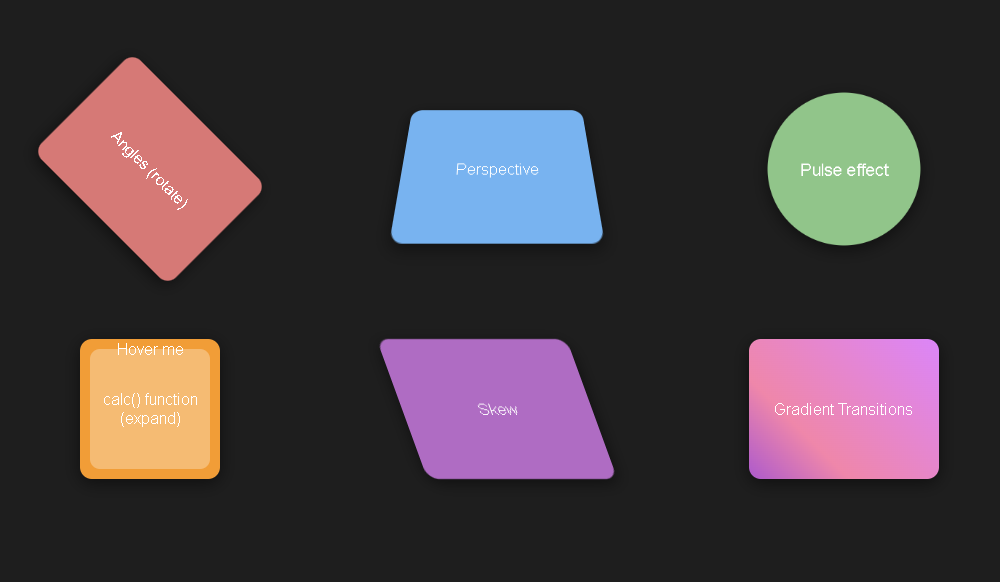
CSS isn't just for styling – it’s also a playground for math! Let's explore six unique mathematical concepts you can use in CSS to create stunning visual effects. We'll dive into angles, perspective, skew, gradients with transitions, and eye-catching uses of the calc() function and trigonometry.
Angles (Rotate)
You can make elements rotate x degrees using thetransform: rotate(xdeg)property.Perspective
You can apply a 3D perspective effect with the
transform: perspective(200px) rotateX(20deg)property.The
perspectivefunction defines how far away the element is from the viewer, essentially creating a vanishing point. It simulates the effect of looking at an object from a distance, where objects farther away appear smaller.
Pulse
You can create a pulsing effect using keyframes. The circle grows and shrinks to simulate a pulsing effect.
calc() Function (Expand)
You can use the
calc()function to create an expanding effect on hover. The inner element expands and changes color when hovered over.The
calc()function allows you to mix different units (such as percentages, pixels, ems, etc.) and perform mathematical operations (addition, subtraction, multiplication, and division) to compute a CSS property value.
Skew
You can use the
transform: skew(20deg)property, creating a slanted effect.The
skew()function skews an element along the X and/or Y axis by a specified angle. This means that the sides of the element will be angled instead of straight, creating a parallelogram-like shape.
Gradient with Transitions
A gradient is a gradual transition between two or more colors. In CSS, you can create gradients using the
linear-gradientorradial-gradientfunctions. These functions allow you to define the direction, colors and stops for the gradient. You can combine multiple gradient animations for a more complex effect.
Check all these possibilities in live action in the demo below. Hover or tap over each element to see the transitions.
Here’s a bonus demo—of a bouncing ball, made purely using CSS to simulate the physics!
Bottom line: If you can imagine something, there is probably a way to create that using CSS—it can be difficult but not impossible.
☕️ Tea Time
News you might have missed
Talking about CSS, I recently explored creating a new type of CSS library following opiniated design principles. Check out my article about it here.
Here’s a shorter LinkedIn post sharing the progress so far and future plans.
Who’s Hiring?
A few months ago, Tailwind Labs, the team behind the popular CSS library, opened up two international remote roles for hiring. These roles are completely remote and pay a standard salary to the hires in $, irrespective of purchasing power parity. While these roles might have been closed at the moment, it is worth taking a look into the JD and processes followed to improve our awareness.
🚀 Power Up
For this episode, I thought of curating some awesome interactive blog posts I discovered recently. Must read!
📨 Post Credits
Stay tuned for the next episode, where we will explore…